NEO Gym, Calpé

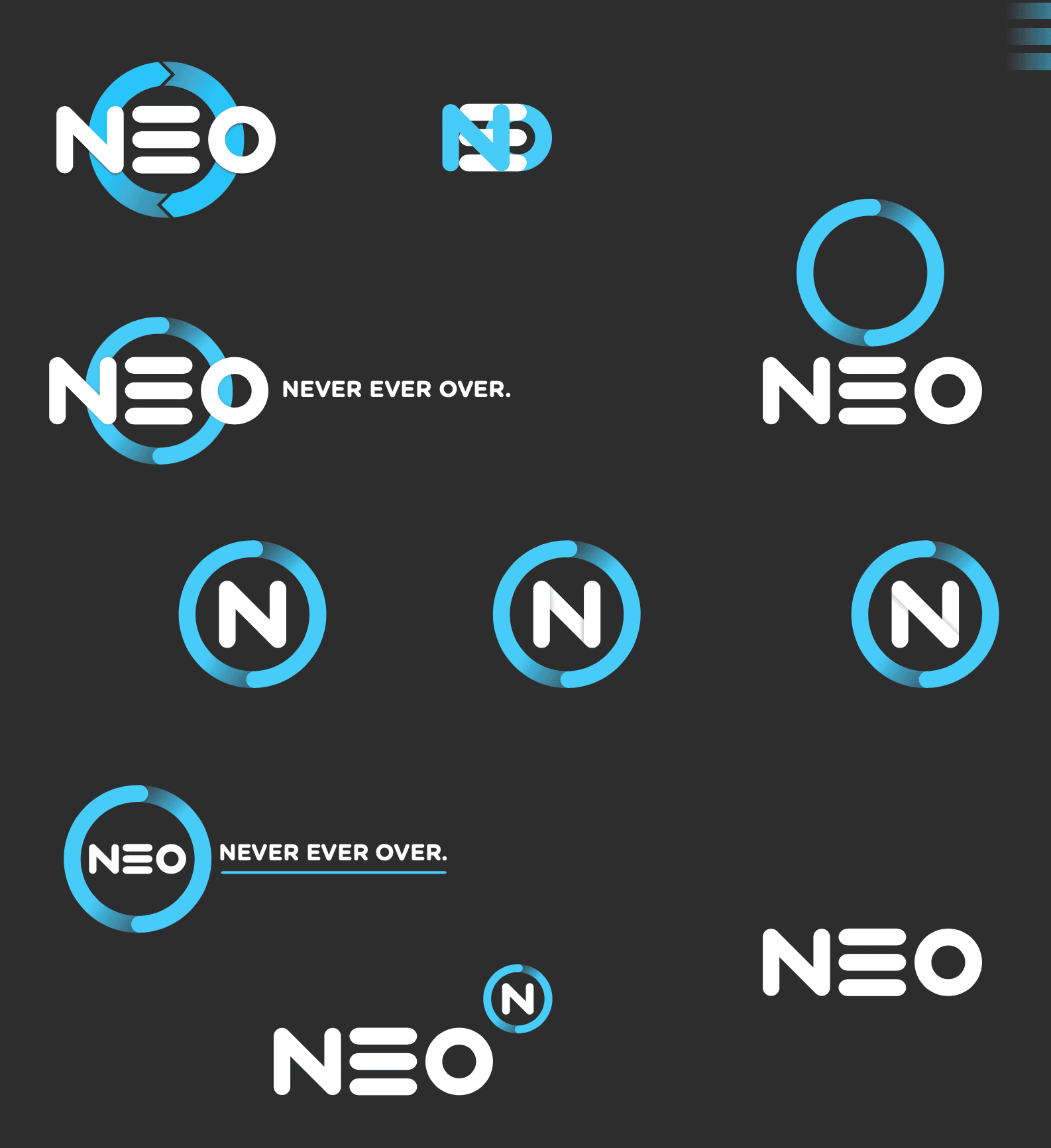
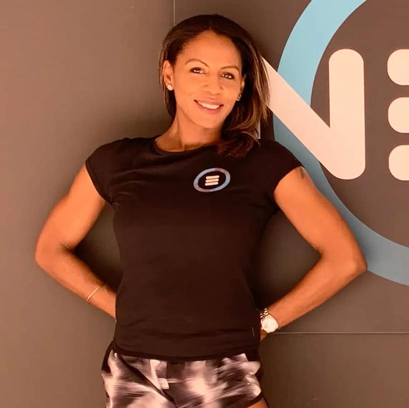
A brand new gym in Spain needed a full identity created. They had the name, NEO, and some idea of what they were going to provide, but nothing more.

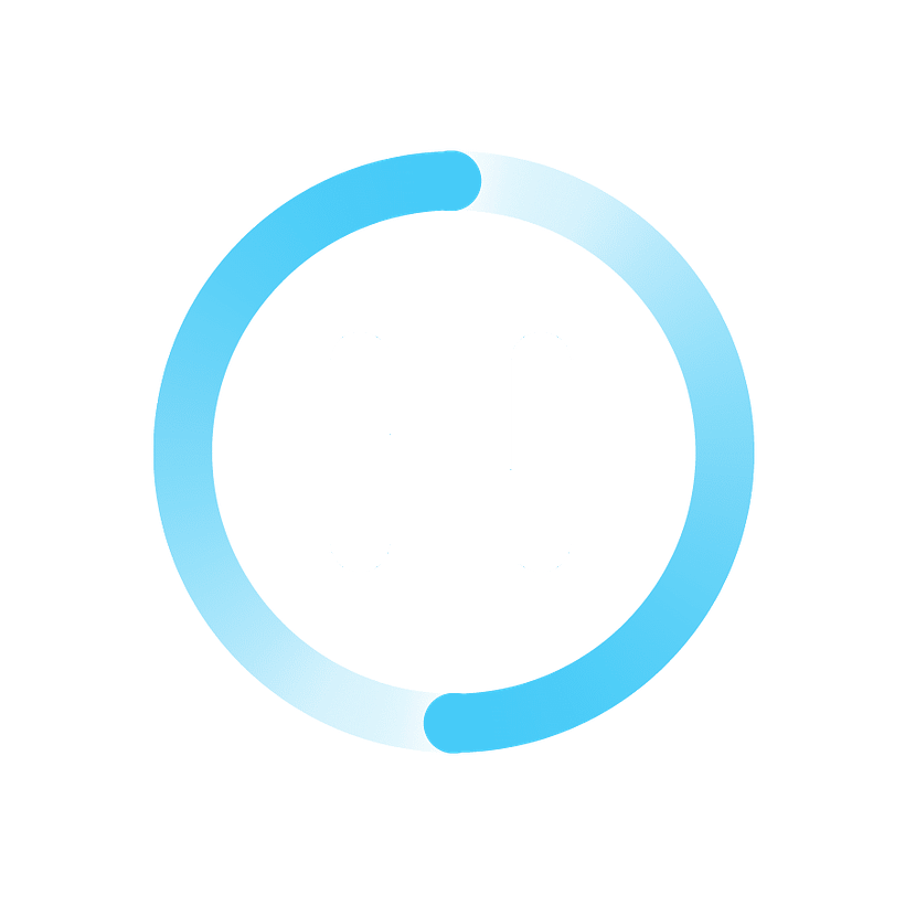
As always I started with some sketches, then went on to mockup a variety of logo variations to see if any particular style resonated with them. I focused on the simplicity of the word and tried to further simplify those letters down to shapes that were still instantly readable.

First round of logo mockups
NEO logos second round

After settling on a colour scheme I then worked more into the forms of the type.

The logo is very circle oriented. Of course with the letter O, which I made perfectly round, but also the ends of the letters are the same size circle, and the circular ‘halo’ that orbits the logo features two more circling orbs. This continuous ring not only frames the text but also echoes their tagline; “Never Ever Over”.

Final NEO logos

The branding Pete created for us has been great. All our gym members love it, so much so that we’ve sold a load of T-shirts with just the logo on! Can’t beat free advertising!

Zoe Baston – NEO Gym, Calpe

Get in Touch

© All rights reserved
Peter Walker 2022

Talk to me!

Got an idea for a new project, or need new life breathing into your business? Let’s talk…

or email me at pete@gogeye.com